Osprey Packs
|
Client |
Osprey Europe Ltd. |
|
Website |
www.ospreyeurope.com |
|
Framework |
Magento |
|
Developed by |
Folk Digital |

Project Description
Osprey is a company that produces high quality backpacks and wanted to bring their range to online ecommerce directly. We worked on the website in two phases with the website launching in late 2013 and new features launched in early 2014. Originally I wasn’t part of the project build and was brought on board during the final amendments of phase 1 where some features such as an interactive rotating bag graphic, needed perfecting.
Eventually I ended up taking the lead on the project going into phase 2 where we added a feature called the Pack Selector. On this project I was liaising directly with the ecommerce manager at Osprey and building up some rapport with the client.
Key Features
Pack Selector
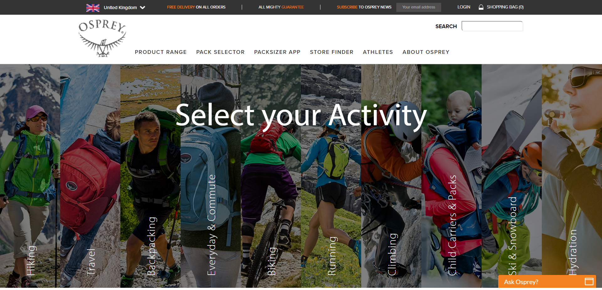
The phase 2 addition we created is called the Pack Selector. When you first land on the page you are presented with a horizontal accordion of 10 options, each presenting a lifestyle usage for their packs. Clicking on one of these options will open up the panel with more detail. The styling challenge here was to ensure the images look good both then the panel is closed and opened and during the transition between both.
The system goes more in-depth by also being a product listing page that displays all the products. When a pack selector panel is opened this list of products then gets filtered to only products in that category. This is actually powered by a layered navigation module. When a panel is opened a click trigger is sent to the filters on the layered navigation and applies it to the product listing.

Like what you see? Let's talk!

